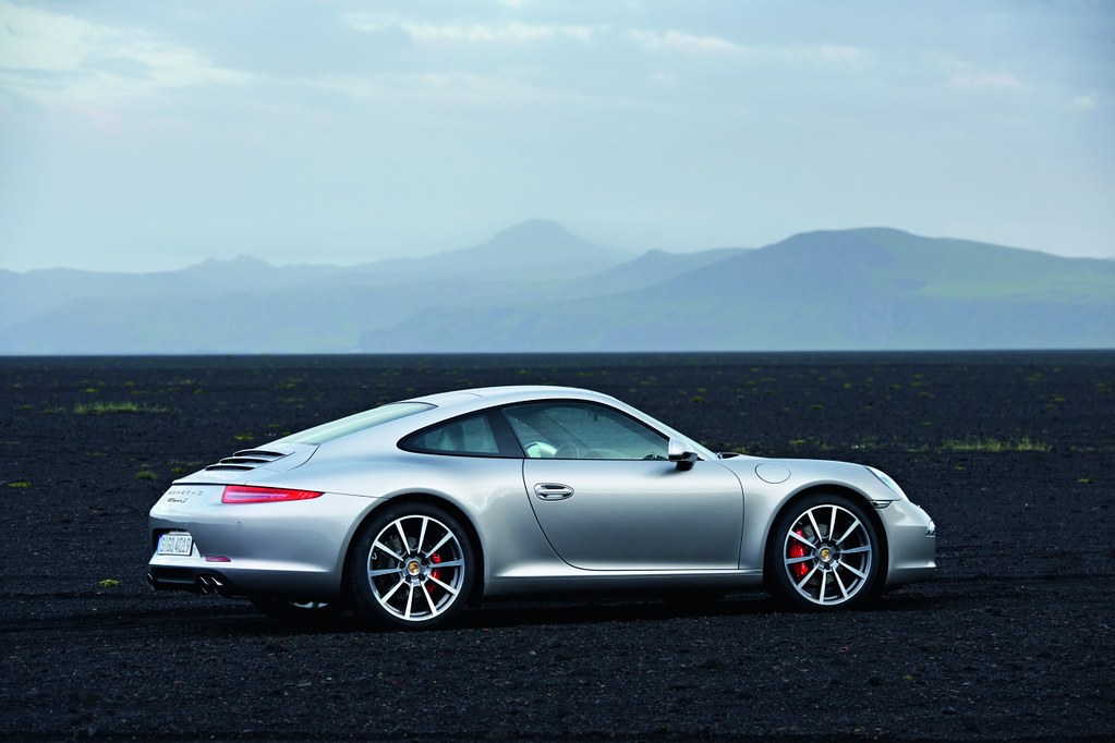
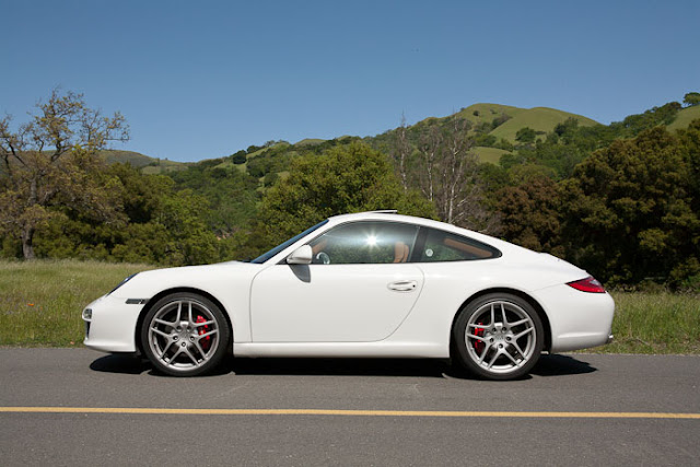
2012 Porsche 911: This is it
#1
#4
The side profile is OK.
Front 3/4 view - strike 1
Rear 3/4 view - strike 2
Interior - strike 3
Just not digging it. Especially the front fascia.
Maybe it will look better in person.
Front 3/4 view - strike 1
Rear 3/4 view - strike 2
Interior - strike 3
Just not digging it. Especially the front fascia.
Maybe it will look better in person.
#5
It appears that the c2s has grown some hips ? We'll wait and see the spec's. Does anyone know when the East Coast roll-out is scheduled ? It's seems to be a matter of scale. I recall waiting / hoping Chevy would make the new Camero about 10% smaller then the '67 version. Assuming a true American sports coupe was due. This pcar seems to be going the opposite way; think Honda Accord '79 vs '08. We American are getting larger, huh ?
#7
Initial thoughts; Love the front end; sleek and sporty. The *** is going to take some getting used to, the taillights are so sharp. The center console is kinda upsetting.
Trending Topics
#10
Not crazy about the front end, looks as though its been squished. And I REALLY hope the production versions come without all the script on the back... We know it's a Porsche, the design hasn't changed for 50 years, no need to literally spell it out.
#11
better pics for ya http://www.teamspeed.com/forums/997-...ial-debut.html
Rear end (***) looks way to long/big

Rear end (***) looks way to long/big

#12
Similar but different. It's a bit over styled in my opinion like the 996 refresh was. This makes my 997.1 look like a classic 911. The interior looks much more upscale in this car.
#15
The Porsche script alone would, and does look good... A number of members have gone this route on the 997 and 996 generation, But you've got to dump the model designation if you do it, otherwise its way too busy back there. X10 if the font's don't even match.


