American Muscle Everything from a Cadillac Escalade to a new Ford GT to a classic C1 Corvette

2014 Corvette Stingray

Thread Tools
 
Search this Thread
 
Rate Thread
 
  #46  
Old 01-18-2013 | 06:02 AM
vrybad's Avatar
Registered User
Joined: Jul 2007
Posts: 553
From: CT
Rep Power: 57
vrybad has a brilliant futurevrybad has a brilliant futurevrybad has a brilliant futurevrybad has a brilliant futurevrybad has a brilliant futurevrybad has a brilliant futurevrybad has a brilliant futurevrybad has a brilliant futurevrybad has a brilliant futurevrybad has a brilliant futurevrybad has a brilliant future
Originally Posted by black penguin
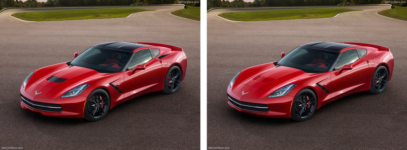
I did some really rough photoshop to "FIX" the bits I dislike the most. The car is just too fussy, trying too hard. Thats why the grey car looks better, it clashes less with the black.

Real car on left, Photoshop on the right

On this image I got rid of the front wings on the splitter, the clack plastic hood scoop and the vents in the rear quaters.


I got rid of the Camaro lights and put some round lights on here. Again, very badly photoshopped, but you can see it immediately feels more like a Vette. I also got rid of the shiny exhausts.
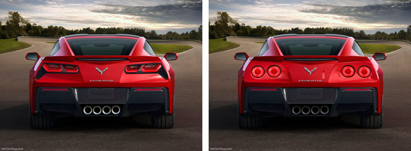


I'd love to see someone else's thoughts on what would make it look much better.


__

Those exterior changes you made simply make it look more like a C6, which is what GM was trying to avoid.

I think it looks great as they designed it.
Form and function combined.
Nice job, GM.
 
  #47  
Old 01-18-2013 | 10:05 AM
quattrogeek's Avatar
Registered User
Joined: Dec 2009
Posts: 129
From: socal/vancouver
Rep Power: 20
quattrogeek is infamous around these parts
Not feeling the rear...its looks fussy as if the designers poured all their energy into the front and were just fresh out of ideas for the rear, so rather than make the back end flow they slapped on a camaro rear end, high fived each other, and called it day. GM design
 
  #48  
Old 01-18-2013 | 10:27 AM
jaspergtr's Avatar
Registered User
Joined: Feb 2006
Posts: 6,220
From: Fayetteville
Rep Power: 497
jaspergtr Is a GOD !jaspergtr Is a GOD !jaspergtr Is a GOD !jaspergtr Is a GOD !jaspergtr Is a GOD !jaspergtr Is a GOD !jaspergtr Is a GOD !jaspergtr Is a GOD !jaspergtr Is a GOD !jaspergtr Is a GOD !jaspergtr Is a GOD !
First Corvette the wife has ever liked. She REALLY likes it.

All of that performance with a mid-50's estimate? We'll see what the 3LT package runs...
 
  #49  
Old 01-18-2013 | 04:02 PM
adamls2's Avatar
Registered User
Joined: Oct 2009
Posts: 982
From: Jax, FL
Rep Power: 57
adamls2 is a jewel in the roughadamls2 is a jewel in the roughadamls2 is a jewel in the rough
I'm a huge Vette fan and I really love the C7 overall. As for the exterior styling, It's only the rear that looks a little funky to me. I would like to see it in all black though! It would hide all the "ricey" black plastic elements, as have been mentioned before.
 
  #50  
Old 01-18-2013 | 04:10 PM
spf4000's Avatar
Registered User
Joined: Jun 2010
Posts: 269
From: SF
Rep Power: 28
spf4000 is a jewel in the roughspf4000 is a jewel in the roughspf4000 is a jewel in the roughspf4000 is a jewel in the rough
Originally Posted by vrybad
Those exterior changes you made simply make it look more like a C6, which is what GM was trying to avoid.

I think it looks great as they designed it.
Form and function combined.
Nice job, GM.
I agree. The new design is a nice leap to keep it modern feeling for the next several years. The circular lights in the chop don't seem to flow as well with the angular design of the rest of the car.

I've already grown accustomed to the rear profile. I wouldn't mind seeing some deeper rear diffuser channels, but I'm sure there will be nice aftermarket solutions.

The wife has already OKed this car and the new NSX, so one of those will be my next car (most likely the Corvette since I expect the NSX to be north of $150k).
 
  #51  
Old 01-18-2013 | 05:15 PM
jaspergtr's Avatar
Registered User
Joined: Feb 2006
Posts: 6,220
From: Fayetteville
Rep Power: 497
jaspergtr Is a GOD !jaspergtr Is a GOD !jaspergtr Is a GOD !jaspergtr Is a GOD !jaspergtr Is a GOD !jaspergtr Is a GOD !jaspergtr Is a GOD !jaspergtr Is a GOD !jaspergtr Is a GOD !jaspergtr Is a GOD !jaspergtr Is a GOD !
Originally Posted by spf4000
I agree. The new design is a nice leap to keep it modern feeling for the next several years. The circular lights in the chop don't seem to flow as well with the angular design of the rest of the car.

I've already grown accustomed to the rear profile. I wouldn't mind seeing some deeper rear diffuser channels, but I'm sure there will be nice aftermarket solutions.

The wife has already OKed this car and the new NSX, so one of those will be my next car (most likely the Corvette since I expect the NSX to be north of $150k).
I feel like you and I share the same brain.

... And our wives do, too.

This is her favorite 'Vette.
 
  #52  
Old 01-19-2013 | 06:53 AM
ShahulX's Avatar
Registered User
Joined: Apr 2011
Posts: 324
From: Germantown, Maryland
Rep Power: 29
ShahulX is just really niceShahulX is just really niceShahulX is just really niceShahulX is just really nice
Yea I'm loving this car... I'm gonna wait for the Z06 but amazing for the z51.. Dry sump, 7speed (low gearing and then hwy gear for mpg), new race seats are awesome, rev match shifting, ability to turn off stability, configurable gauge cluster... I love everything about the looks (I like the tailights and vent)... Only thing is I wish the hood vent was body colored.. Easy fix
 
  #53  
Old 01-19-2013 | 10:28 AM
1 slow 97's Avatar
Registered User
Joined: Jan 2008
Posts: 203
From: Charleston, SC
Rep Power: 25
1 slow 97 is infamous around these parts
Originally Posted by adamls2
I'm a huge Vette fan and I really love the C7 overall. As for the exterior styling, It's only the rear that looks a little funky to me. I would like to see it in all black though! It would hide all the "ricey" black plastic elements, as have been mentioned before.
you can see it, go to this link. click on specs on lower right, then you can choose color, wheel color, and angle to view the C7.

http://www.chevrolet.com/new-2014-corvette/

Black or Silver is going to be what I am ordering.
 
  #54  
Old 01-19-2013 | 01:55 PM
adamls2's Avatar
Registered User
Joined: Oct 2009
Posts: 982
From: Jax, FL
Rep Power: 57
adamls2 is a jewel in the roughadamls2 is a jewel in the roughadamls2 is a jewel in the rough
Thumbs up

Originally Posted by 1 slow 97
you can see it, go to this link. click on specs on lower right, then you can choose color, wheel color, and angle to view the C7.

http://www.chevrolet.com/new-2014-corvette/

Black or Silver is going to be what I am ordering.
Definitely blk/blk for me. Silver or white would be my second. Depending on how high gloss the black components would come off in person; it would completely change the look of the car, but I have a feeling a lot of people are going to be customizing it left and right to their taste.
 
  #55  
Old 01-19-2013 | 02:16 PM
ShahulX's Avatar
Registered User
Joined: Apr 2011
Posts: 324
From: Germantown, Maryland
Rep Power: 29
ShahulX is just really niceShahulX is just really niceShahulX is just really niceShahulX is just really nice
i like the pics of the grey one... Id do that
 
  #56  
Old 01-19-2013 | 02:31 PM
blackbull's Avatar
Registered User
Joined: Dec 2008
Posts: 396
From: New York
Rep Power: 61
blackbull has a reputation beyond reputeblackbull has a reputation beyond reputeblackbull has a reputation beyond reputeblackbull has a reputation beyond reputeblackbull has a reputation beyond reputeblackbull has a reputation beyond reputeblackbull has a reputation beyond reputeblackbull has a reputation beyond reputeblackbull has a reputation beyond reputeblackbull has a reputation beyond reputeblackbull has a reputation beyond repute
Originally Posted by black penguin
Bigger image of the rear with round lights:


Uploaded with ImageShack.us

THIS I like!!!!!
 
  #57  
Old 01-19-2013 | 02:58 PM
hroussard's Avatar
Registered User
Joined: Nov 2004
Posts: 2,153
Rep Power: 196
hroussard Is a GOD !hroussard Is a GOD !hroussard Is a GOD !hroussard Is a GOD !hroussard Is a GOD !hroussard Is a GOD !hroussard Is a GOD !hroussard Is a GOD !hroussard Is a GOD !hroussard Is a GOD !hroussard Is a GOD !
I like the "angry Bird" back side ! :-)
 
  #58  
Old 01-19-2013 | 03:11 PM
ShahulX's Avatar
Registered User
Joined: Apr 2011
Posts: 324
From: Germantown, Maryland
Rep Power: 29
ShahulX is just really niceShahulX is just really niceShahulX is just really niceShahulX is just really nice
yea i like the actual tailights, not the round photoshop ones...
 
  #59  
Old 01-19-2013 | 03:27 PM
Enilder's Avatar
Registered User
Joined: Jan 2007
Posts: 3,445
From: Northeast
Rep Power: 183
Enilder has a reputation beyond reputeEnilder has a reputation beyond reputeEnilder has a reputation beyond reputeEnilder has a reputation beyond reputeEnilder has a reputation beyond reputeEnilder has a reputation beyond reputeEnilder has a reputation beyond reputeEnilder has a reputation beyond reputeEnilder has a reputation beyond reputeEnilder has a reputation beyond reputeEnilder has a reputation beyond repute
Originally Posted by ShahulX
yea i like the actual tailights, not the round photoshop ones...
+1. The round taillights look too much like GTR rear end. I think it's good as is.
 
  #60  
Old 01-20-2013 | 06:03 AM
ShahulX's Avatar
Registered User
Joined: Apr 2011
Posts: 324
From: Germantown, Maryland
Rep Power: 29
ShahulX is just really niceShahulX is just really niceShahulX is just really niceShahulX is just really nice
Plus the vents by the rear lights are functional


You have already rated this thread Rating: Thread Rating: 0 votes,  average.


All times are GMT -6. The time now is 03:05 PM.