

Audi modernizes logo and lettering
#1
 08-24-2009, 04:54 PM


Join Date: Jun 2008
Location: Germany
Posts: 3,079
Rep Power: 226 

Audi modernizes logo and lettering
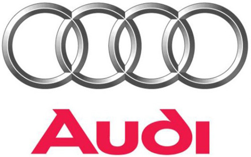
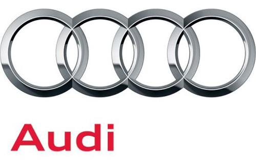
Audi just gave their logo a refresh. The old logo, which you can see below was already a modern version of their four rings logo they’ve had since 1932 and featured a three-dimensional depth and shadowing. The new logo gives the rings a new shine resembling polished chrome, much like you see on the front of all new Audis.
The font has also been updated from the odd-looking text to a new, more symmetrical and sans-serif font, and is also moved to the left instead of centered. The update reflects design trends of the 21st century and keeps the brand looking fresh.
old:
new:
it was already used for the new A5 sportback trailer (at the end):
http://www.youtube.com/watch?v=jaFOmNBr8FM
Last edited by catchmyshadow; 08-24-2009 at 05:06 PM.


Trending Topics
#9
08-29-2009, 03:11 PM
Join Date: Jun 2008
Location: Germany
Posts: 3,079
Rep Power: 226
the marketing department and they didn`t make much wrong in the last 10 years. i think most of us wouldn`t even have recognized the difference if they wouldn`t have released a press statement and i don`t think that Audi is pissed if fans continue to like and use their old graphics (on flags etc.) 
the rings are by far the more important part of the logo imho and it looks fresher and sharper but i understand the love for old school elements.
the rings are by far the more important part of the logo imho and it looks fresher and sharper but i understand the love for old school elements.

#12
08-31-2009, 12:46 PM
Join Date: Jun 2008
Location: Germany
Posts: 3,079
Rep Power: 226
just because the S4 came out before the A5 Sportback. From the new Sportback clip on they are using the new logo.
#14
09-09-2009, 06:47 PM
Join Date: Jun 2008
Location: Germany
Posts: 3,079
Rep Power: 226
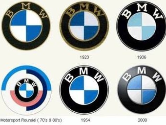
by the way, Audi is not the only one who updates his logo from time to time:
Last edited by catchmyshadow; 09-09-2009 at 06:57 PM.
